Two lobby signs can share a logo, a size, and a material and still look a price bracket apart. The difference is rarely the sheet they were cut from. It sits in the edges, the paint, the shadow behind each letter, and how straight the whole thing hangs. Those details are what visitors read as "established" before anyone at the desk says hello.
This guide walks through the seven details we check on every reception wall we build, and how you can check them on a proof or a finished sign. If you are still at the budgeting stage, our guide to lobby sign cost covers what moves the price. This one covers what makes the result look worth it.
Key Takeaways
- A high-end lobby sign is defined by finish and fit, not by the most expensive material.
- Look at edges, color match, letter depth, hidden hardware, and level before anything else.
- Konica Minolta puts a color difference above 3 Delta E as unacceptable in most industries, so ask how brand colors are checked.
- In a 2026 Harris Poll survey for Signarama, 90 percent of US adults said signage shapes whether they see a business as professional.
What separates a high-end lobby sign from a catalog sign?
A high-end lobby sign is designed for one wall and built to survive close inspection. A catalog sign is a standard panel or letter set in a standard size, made to fit any wall. Both can use the same acrylic or brushed composite. The premium one wins on scale, finish quality, color accuracy, and an install with no visible hardware or drift.
Visitors view a reception sign from a few feet away while they wait, often for minutes at a time. That is a harder test than a storefront sign read from a moving car. Every rough edge, every slightly different shade of red, and every letter a few millimetres off level gets noticed, even by people who could not tell you why.
Catalog signs are not bad. They are fine for a suite number or a policy panel. The problem starts when a reception wall, the single most photographed surface in your office, gets the same treatment. The seven details below are where a boutique build earns its price.
| Detail | Catalog sign | Boutique build |
|---|---|---|
| Size | Standard sizes, picked from a chart | Laid out at true scale on a photo of your wall |
| Artwork | Logo approximated from a font or template | Cut from your vector artwork, or rebuilt to match it |
| Color | Nearest stock color | Painted or printed to your Pantone or hex values |
| Edges | Left as cut | Finished to suit the material and the light |
| Depth | Thin stock, flat to the wall | Thickness and standoff chosen for a shadow line |
| Hardware | Visible screws or tape | Concealed studs or deliberate standoffs |
| Install | Measured by eye | Full-size paper template, leveled once |
Design that starts with your wall, not a template
The first craftsmanship detail happens before anything is cut. A boutique lobby sign starts with a photo of your actual wall, its finish, its lighting, and the sightline from your front door. The logo is then sized and placed for that view. A sign that fits its wall looks intentional, while the same sign two inches too small looks like an afterthought.
We lay every reception sign out in CAD at true scale, then composite the proof onto your own wall photo. That lets you judge size and placement with your eyes rather than a number on a spec sheet. Measure the usable wall width and the distance from your entrance before you ask for a proof.
Design also means reading the room. A dark wood-slat wall wants a light or metallic logo for contrast. A white gallery wall can carry gloss black letters or a halo glow. Furniture, artwork, and doors near the wall all change what size and finish will read well, so we ask about them before proposing a material.
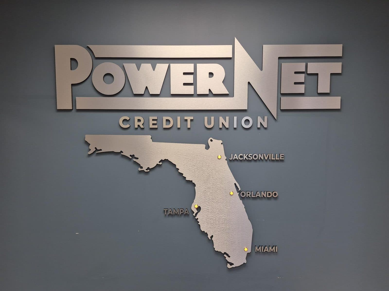
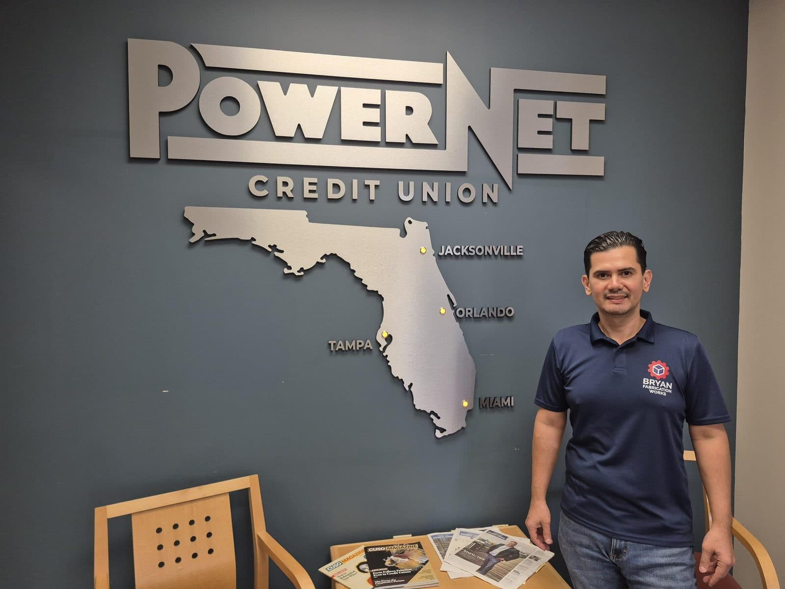
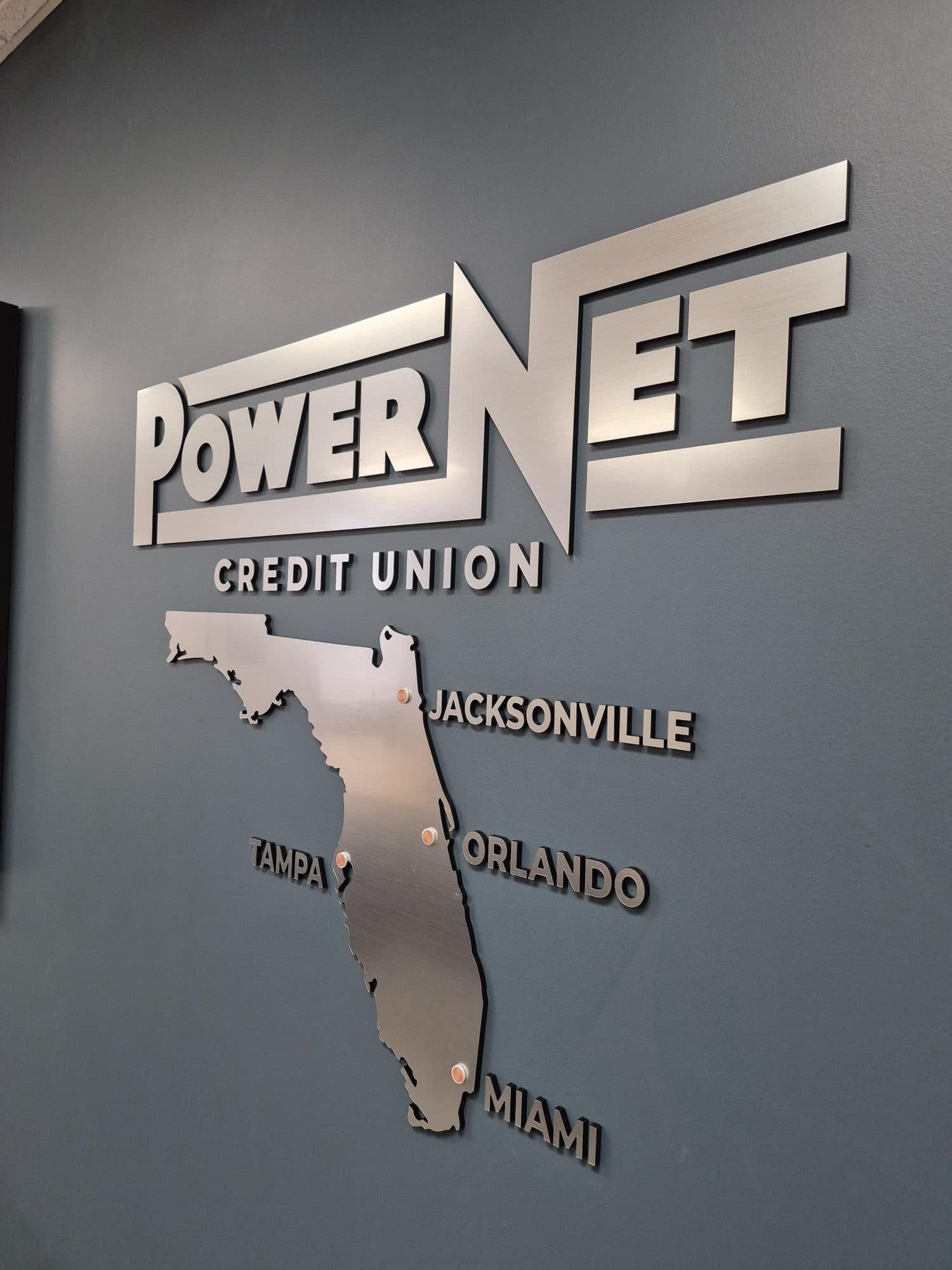
From the shop floor: The PowerNet Credit Union wall pairs the logo with a cut Florida map and small lit location markers, all in brushed metal-finish composite. A standard letter set has nowhere to put that kind of element. It only works when the wall is designed as one piece, with the logo, the map, and the lights laid out together.
Edges, finish, and an exact color match
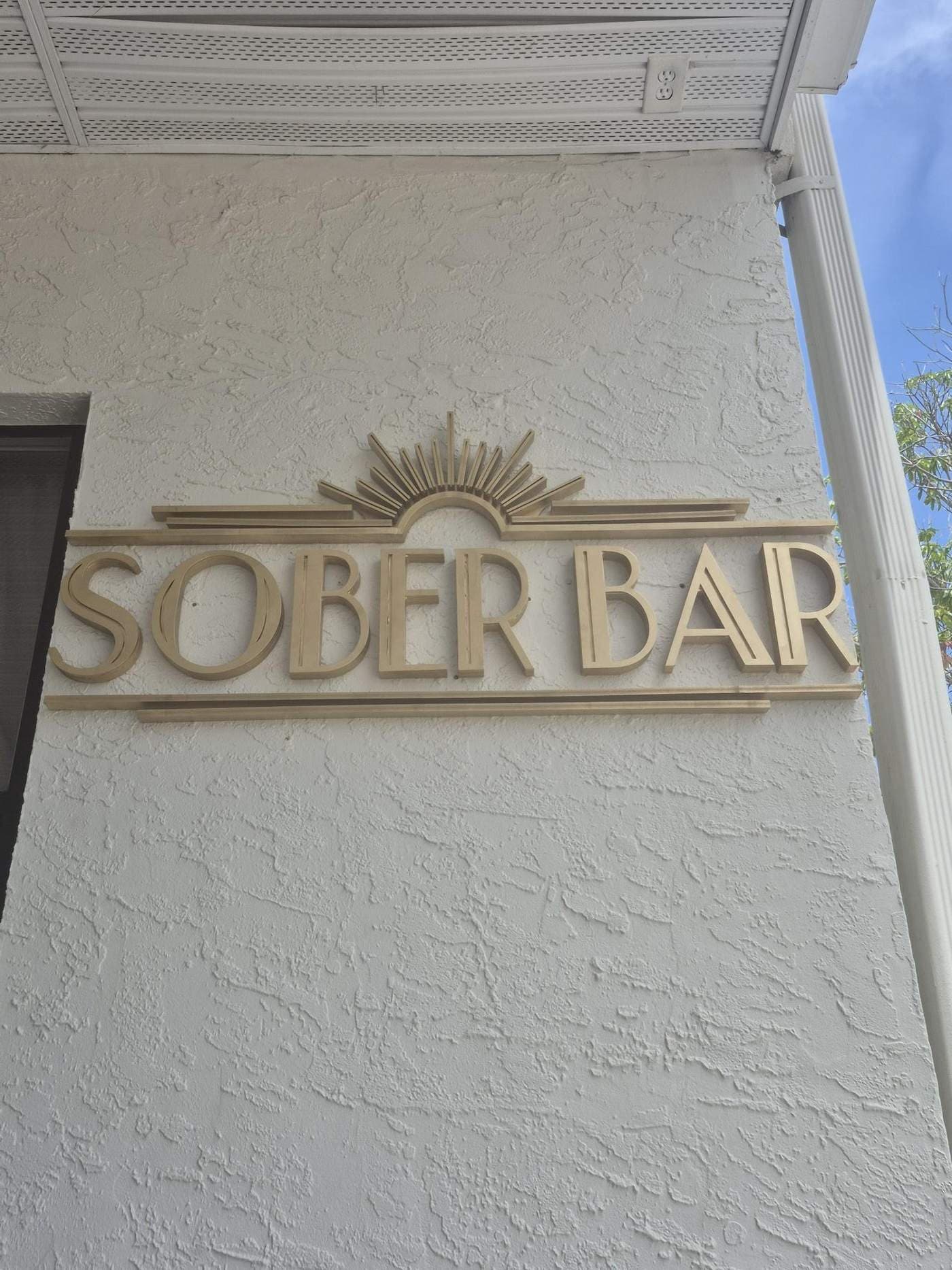
Edges and color are where cheap signs give themselves away up close. A premium sign has clean, consistent edges on every letter, with no tool marks, chatter, or melted corners. Its colors match your brand guide closely enough that the wall logo and your printed materials look like the same company. Both are easy to check on a sample.
Acrylic edges come off the router or laser with marks that need finishing. ACRYLITE's fabrication guide treats flame polishing as a final step after sanding and recommends annealing afterward to reduce the risk of crazing (ACRYLITE, Finishing ACRYLITE Acrylic Sheet, 2026). Diamond polishing is another route for straight edges. Multicam notes its diamond finishing tools pass within about 0.003 to 0.007 inch of the edge (Multicam, How to get a polished edge finish on acrylic, 2020).
Color is the second test. Konica Minolta's guide to Delta E, the standard measure of color difference, describes a value below 1 as invisible and above 3 as unacceptable in most industries (Konica Minolta Sensing, Understanding Colour Difference: What is Delta E, 2026). It also notes that luxury brands often demand tighter tolerances than industrial ones.
You do not need a spectrophotometer to judge this. Ask for a painted sample, then hold it next to your business card, your website on a phone, and any existing signage under your lobby lighting. If you only have a logo image and no brand guide, we color-match from the file and show a sample before the full run. Our guide on preparing a logo file explains what artwork makes this fastest.

Depth, shadow lines, and hidden hardware
Depth is what makes a dimensional sign read as architecture instead of a decal. A high-end lobby sign uses letter stock thick enough to hold its shape and stands slightly off the wall, so each piece throws a clean shadow. The hardware that achieves this is either completely hidden or chosen on purpose as part of the design.
Stud mounting is our default for letters and logos. Concealed pins bonded into the back of each piece drop into a drilled pattern, so nothing shows from the front. Gemini's product guide describes stud mounts as threaded rods set into the back of the sign and mounted into pre-drilled holes (Gemini Product Guide, Mounting Hardware: The Foundation Behind Every Sign, 2026). Spacers on those studs set the gap between letter and wall.
Standoffs are the other premium option: polished barrels at the corners of a panel that make it float. They are visible by design, so they should be sized and spaced evenly, not added wherever a hole happened to land. What should never show on a lobby sign is a screw head, a strip of tape at the edge, or a letter rocking on one stud.
Thickness matters as much as hardware. A large letter cut from thin sheet looks flimsy from the doorway, even if it is perfectly painted. We match stock thickness to letter size, which our dimensional letters page and our letter materials comparison explain in more detail.
Light that glows evenly, not in hot spots
A premium halo-lit sign produces a smooth, even glow around every letter, with no bright dots, dark gaps, or one corner brighter than the rest. Uneven light is the most common flaw in budget lit signs. It comes from LED modules spaced in a straight strip instead of being laid out to the shape of the logo.
We lay modules out to follow each shape, use UV-stable acrylic that resists yellowing, and size power supplies with headroom rather than running them at their limit. The wall matters too. Flat light paint throws a halo back beautifully, while dark wood or textured stucco absorbs it, so we set standoff depth and brightness for your actual wall.
Ask to see a lit sample or a photo of a finished halo sign taken in a dim room. Hot spots and gaps are obvious there, even when a daylight photo hides them. Our LED signs page covers what we build, and we compare the styles in halo-lit vs backlit vs front-lit signs. Our illuminated work is for interior and covered-exterior locations, which suits a reception wall.

How to check a shop's craftsmanship before you pay
You can judge craftsmanship before signing a quote by asking for three things: a scaled proof on your own wall photo, a physical finish sample, and close-up photos of past work. A shop that builds premium lobby signs will have all three ready. A shop that resells catalog signs usually only has full-wall photos taken from across the room.
Close-ups are the tell. Ask for photos taken from a few feet away, at an angle, showing edges, letter sides, and the shadow line. That is the view your visitors will have. Then ask the questions in this table, and listen for specific answers rather than general reassurance.
| Ask this | A good answer sounds like |
|---|---|
| How will you size it? | "We lay it out at true scale on your wall photo before cutting." |
| How do you match our colors? | "Send Pantone or hex values; we paint a sample for your approval." |
| How are the edges finished? | Names a method for the material, such as polished or painted returns. |
| What hardware shows? | "None on letters; standoffs only if you choose that look." |
| How do you keep it level? | "A full-size paper template, leveled once, then drilled." |
| Who installs it? | The same people who built it, or a template and hardware for your team. |
A design-and-build shop has an advantage here. When the people who drew the proof also cut, finish, and hang the sign, nothing gets lost between vendors. The version on your wall matches the version you approved. See how we work on our lobby signs in Tampa page.
Is a boutique lobby sign worth the premium?
For most offices that receive clients, patients, or candidates, yes, because the reception wall is seen at every first meeting for years. Research on signage and perception supports that, with a caveat. It studies signage broadly, mostly storefronts, rather than lobby signs specifically, so treat it as directional.
In a survey of 2,007 US adults fielded by The Harris Poll for Signarama in July 2026, 90 percent said signage shapes whether they view a company as professional. Eighty-two percent said it affects their trust in a business (PR Newswire, The Sign Effect: New Survey Reveals 84% of Consumers Say Signage Directly Influences Their Purchase Decisions, 2026).
Two honest caveats. The survey was commissioned by a sign franchise, and it asks about signage in general. Nobody hires a law firm because of the logo behind the desk. What the finding does support is the first-impression point. In a room where people sit and look, a sign that is slightly off quietly works against everything else you have invested in the space.
Premium also does not have to mean the most expensive material. A correctly sized painted PVC logo with clean edges beats a too-small brushed one. We will tell you when the cheaper build in the right size is the better call. Send a logo, a straight-on wall photo, and rough dimensions through our quote form for a scaled proof.
Frequently Asked Questions
What makes a lobby sign look high-end?
Fit and finish, more than material. A high-end lobby sign is sized to its wall, cut from your actual artwork, painted to your exact brand colors, and finished cleanly on every edge. It stands off the wall enough to throw a shadow, hides its hardware, and hangs perfectly level. A cheaper material done that way often looks better than a premium one done carelessly.
Is brushed metal-finish composite a premium lobby sign material?
Yes. Brushed aluminum composite has a real brushed metal surface on two thin aluminum skins over a lighter core, so it reads as solid metal at close range while staying light enough to stud-mount on drywall. It is our most-requested lobby material for law, financial, and professional offices that want an established look without the weight and cost of solid metal.
How do I know my brand colors will match on the sign?
Ask for a physical sample before the full run, and compare it with your business card, your website, and existing signage under your lobby lighting. Send Pantone or hex values if you have a brand guide. Konica Minolta describes a color difference above 3 Delta E as unacceptable in most industries, so a visible mismatch on the sample is worth raising before production.
Can a boutique sign shop design our lobby sign from scratch?
Yes, if the shop handles design in-house. We lay out reception signs in CAD at true scale, rebuild logos from website images or business cards when vector files are missing, and composite proofs onto your wall photo. Additions like a cut map, a tagline panel, or a halo-lit element can be proposed at that stage, before anything is cut.
Are halo-lit lobby signs worth it for a premium look?
Often, when the glow is even. A halo-lit logo changes how a reception area feels in the evening and in dim waiting rooms. The risk is uneven light from poorly spaced LED modules, so ask for a lit photo taken in a dark room. If the budget is tight, build it unlit with the standoff depth an LED version needs and add lighting later.
Sources
- ACRYLITE, Finishing ACRYLITE Acrylic Sheet, retrieved 2026-11-05, https://www.acrylite.co/resources/fabrication-manuals/finishing-acrylite-acrylic-sheet
- Multicam, How to get a polished edge finish on acrylic, retrieved 2026-11-05, https://www.multicam.com/polished-edge-on-acrylic
- Konica Minolta Sensing, Understanding Colour Difference: What is Delta E, retrieved 2026-11-05, https://sensing.konicaminolta.eu/mi-en/colourblogtop/colour-blog/whatisdeltae
- Gemini Product Guide, Mounting Hardware: The Foundation Behind Every Sign, retrieved 2026-11-05, https://hub.geminimade.com/knowledge/mounting-hardware-the-foundation-behind-every-sign
- PR Newswire (Signarama), The Sign Effect: New Survey Reveals 84% of Consumers Say Signage Directly Influences Their Purchase Decisions, retrieved 2026-11-05, https://www.prnewswire.com/news-releases/the-sign-effect-new-survey-reveals-84-of-consumers-say-signage-directly-influences-their-purchase-decisions-302871443.html
- Under30CEO, Business Signage Sways 84% of Shoppers, New Survey Finds, retrieved 2026-11-05, https://www.under30ceo.com/business-signage-survey-shoppers-2026/
About the author
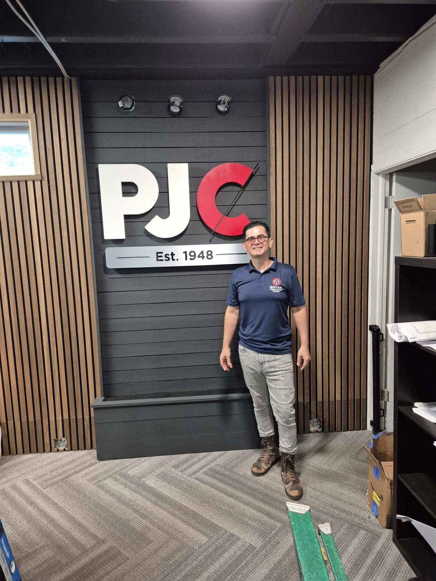
Bryan · Owner, Bryan Fabrication Works
Bryan owns and runs Bryan Fabrication Works, a Tampa sign shop that designs, cuts, finishes, and installs lobby signs, halo-lit LED signs, dimensional letters, ADA signage, and memorial boards under one roof. The guides here come from the questions customers ask him during quotes, and from the jobs in the portfolio.
More about the shop